Covid-19 Deaths v Flu Shot Rates

In this post I will explore whether there is a correlation between Covid-19 deaths and elderly influenza vaccination rates across countries.

Introduction

At least two studies have found an association between flu vaccines and susceptibility to other non-influenza respiratory diseases, including other coronaviruses:

  • Cowling, 2012 – a randomised controlled trial (RCT) in which 69 children were given a flu shot and 46 a placebo. 20 vaccinated children (29%) got sick with a non-flu virus and only 3 unvaccinated children (6.5%) got sick with a non-flu virus, a statistically significant result. The most common non-flu viruses detected were rhinoviruses and coxsackie/echoviruses. For both these virus types, a significant association was found between getting a flu shot and susceptibility to the virus. The sample size was too small to identify any association between flu shots and coronaviruses.
  • Wolff, 2020 – a retrospective study of the illness and vaccination records of 9469 individuals working for the Department of Defense, of which 6541 had received the 2017/8 seasonal flu shot and 2928 had not. The flu shot was associated with reduced risk of getting the flu but an increased risk of non-influenza illnesses, including specifically coronaviruses. 507 (7.8%) of the vaccinated and 170 (5.8%) of the unvaccinated tested positive for a coronavirus, resulting a significant relationship with an odds ratio of 1.36 [1.14-1.63 95% CI].

The above studies suggest that the flu shot may increase susceptibility to coronaviruses, possibly by a mechanism known as viral interference. It is hypothesised that the flu shot may increase susceptibility to SARS-CoV-2 via the same mechanism. Hence, there are reasons to expect a correlation between flu shot rates and Covid-19 death rates.

Correlation does not imply causation, obviously. No ecological study, no matter how strong the correlation, can ever be strong evidence of causation. They can merely give us a clue about where to look and what further studies to do. Ecological studies are low on the evidence hierarchy (beneath RCTs, cohort and case-control studies) but they are quick, cheap and easy, which is why these studies are often first to emerge in cases like this.

Since we have no studies of the stronger types yet, ecological studies are the best we can do for Covid-19 at the moment. One study comparing regions of Italy can be found here; a significant negative correlation was found, but no confounders were examined. Here I will present my analysis of the international data we have for flu vaccination rates and Covid-19 death rates, and then examine six possible confounders.

Data Sources

Covid-19 death rates per million people by country are available from Our World In Data. In this study, death rates as at 31st July 2020 were used.

Influenza vaccination rates in elderly people (defined for most countries as aged 65+) are available from The OECD. However, data from within the last 5 years is only available for 31 out of the 37 OECD countries. I could find no explanation why there is no recent data for the 6 other OECD countries (Austria, Australia, Colombia, Mexico, Poland and Switzerland). In this study, latest available vaccination rate data is used for each country (for most countries, this is the 2018/9 seasonal flu vaccine uptake rates).

Europe

There are 23 European countries in the OECD for which flu shot data is available. I have excluded two of them – Iceland and Luxembourg – for having a population of less than a million. The remaining 21 countries are shown in the following plot:

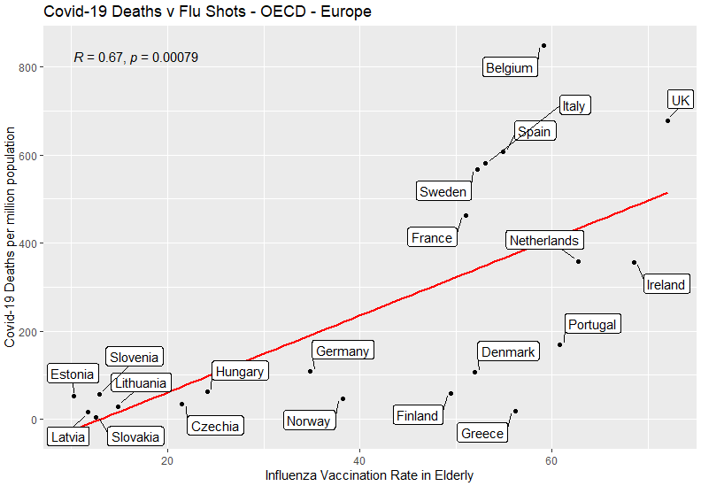
As indicated by the slope of the red line, there is a positive correlation between these two variables. A correlation coefficient is a measure of the degree to which a pair of variables are linearly related, between -1 and +1. As shown on the chart, the correlation coefficient R is 0.67, which is considered a moderate-to-high correlation. The p-value of <0.01 shows that the null hypothesis (i.e. no relationship between these variables) is falsified by the data, with a confidence level exceeding 99%.
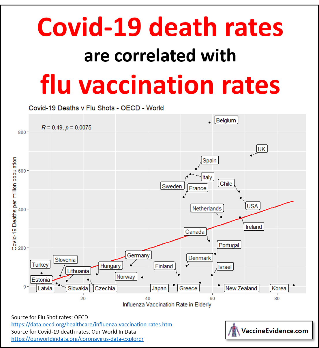
World

There are 8 non-European OECD countries for which data is available: Canada, USA, Chile, Turkey, Israel, Korea, Japan and New Zealand. Adding these countries to the plot, we find:

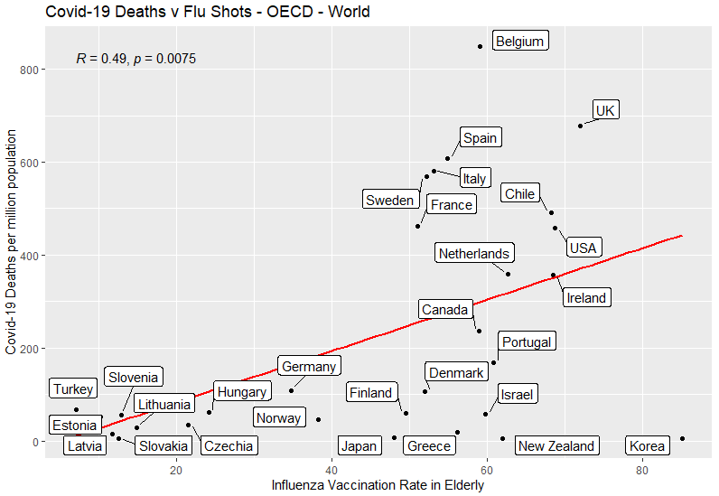
The positive correlation is still present but is weakened, the correlation coefficient now 0.49. This is due to Korea, Japan and New Zealand all being outliers, having high vaccination rates and low Covid-19 death rates. The p-value of <0.01 shows that the null hypothesis of no relationship between these variables is falsified by the data, with a confidence exceeding 99%.

Confounders

One way to improve an ecological study beyond a single-variable is to look for confounders. A confounder is a variable that influences both the dependent variable and independent variable, causing a spurious association. I have looked at all of the following six variables that have been suggested to me as possible confounders:

  • Income (as GDP-per-capita)
  • Population density
  • Elderly as a proportion of population
  • Climate (as average temperature in April)
  • Health of population (as life expectancy)
  • Healthcare system (as hospital beds per population)

Income

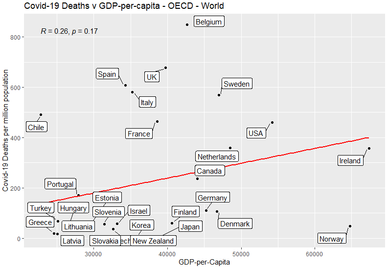
Slight positive correlation: richer countries had more Covid-19 deaths. Not statistically significant.

Population Density

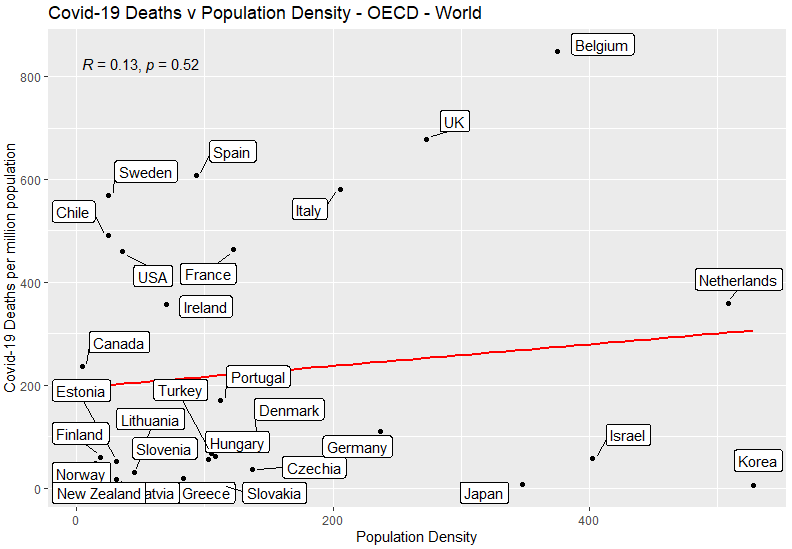
No correlation: being more densely packed is not associated with more Covid-19 deaths.

Elderly Population

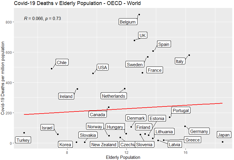
No correlation: having more elderly people is not associated with having more Covid-19 deaths.

Climate

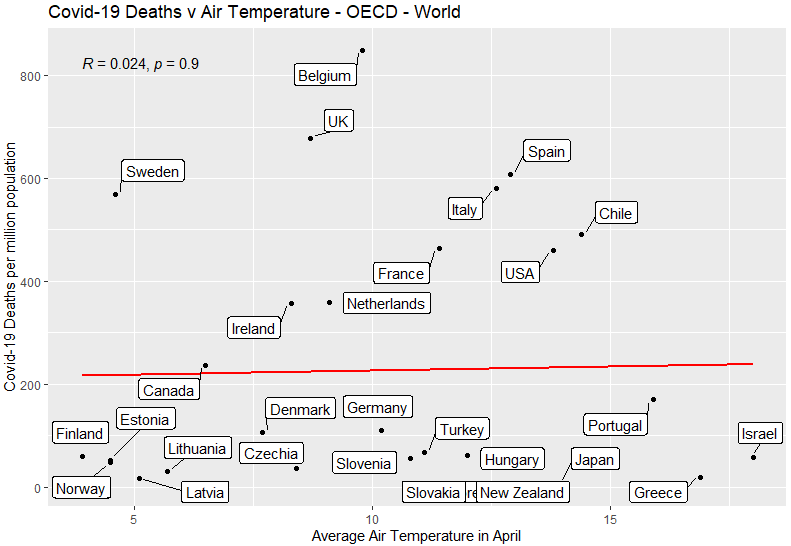
No correlation: being a colder country is not associated with more Covid-19 deaths.

Health of Population

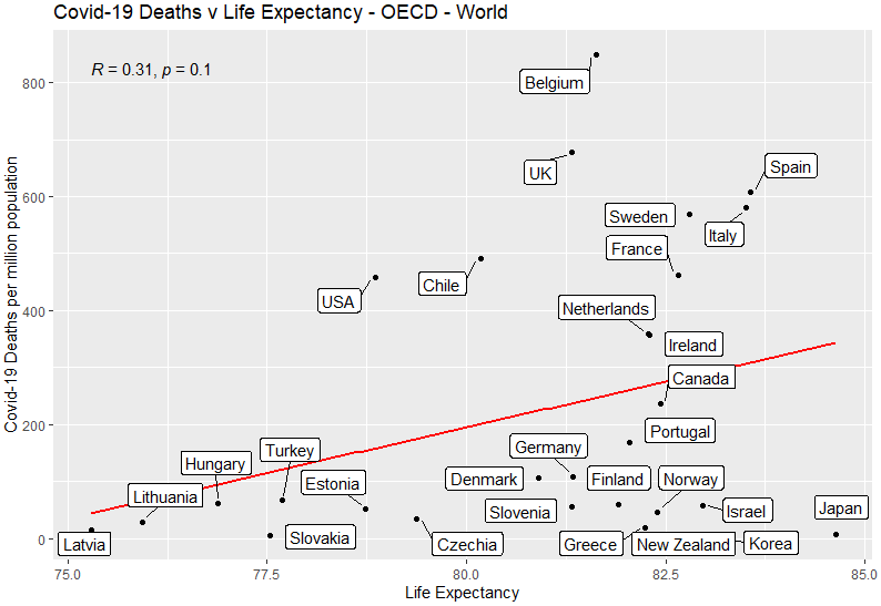
Slight positive correlation: countries where people live longer had more Covid-19 deaths. Not statistically significant.

Healthcare System

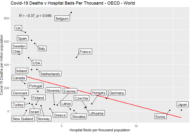
Here we have a weak but statistically significant correlation: countries with more capacity in the healthcare system had fewer Covid-19 deaths. The correlation coefficient is -0.37, and with a p-value of 0.049, the result is significant with 95% confidence but not 99% confidence.

Multivariate Models

Two Variables

Out of the 7 variables tested, two showed a significant relationship with Covid-19 death rates: flu shot rates and hospital beds. If we create a model based on these two variables, we obtain the following:

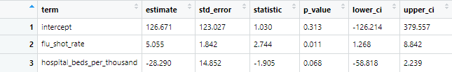
The p-value for the flu shot rate is still <0.05, so remains significant to a 95% confidence level, but the p-value for the hospital beds has gone to 0.068, so is no longer statistically significant at that level.

Seven Variables

If we create a model based on all seven variables that we have, we obtain the following:

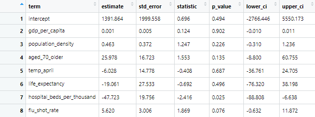
Here we have an opposite result to the two-variable model. The p-value for the hospital beds is still <0.05, so remains significant to a 95% confidence level, but the p-value for the flu shot rate has gone to 0.076, so is no longer statistically significant at that level.

Conclusion

Does the flu shot make us more vulnerable to Covid-19? Until we have better kinds of studies, ecological studies of Covid-19 death rates against flu vaccination rates are the best way to get an idea of whether the flu shot makes people more susceptible to Covid-19 due to viral interference, as seems to occur with other coronaviruses.

This ecological analysis found a correlation coefficient of 0.67 when only European OECD countries are included. This would be classified as a moderate-to-high positive correlation. With the addition of non-European OECD countries the correlation coefficient is 0.49, a low-to-moderate positive correlation. This contradicts the finding of the study of Italian regions, which found a negative correlation of -0.58, without looking for confounders. Confounders between Italian regions should be examined, and similar studies of regions within countries should be done to try and resolve this apparent contradiction.

Six possible confounders have been analysed and one (hospital beds per thousand population) was found to have a significant association to Covid-19 deaths, just like the flu shot rates. When combined into a multivariate model, these two variables seem to cancel out, to the extent that one of them becomes statistically significant, but which one is dependent on what other variables are included in the model. I cannot explain this behaviour – if you think you can, let me know!

Appendix: Paul’s Chart

This picture has been shared on social media:

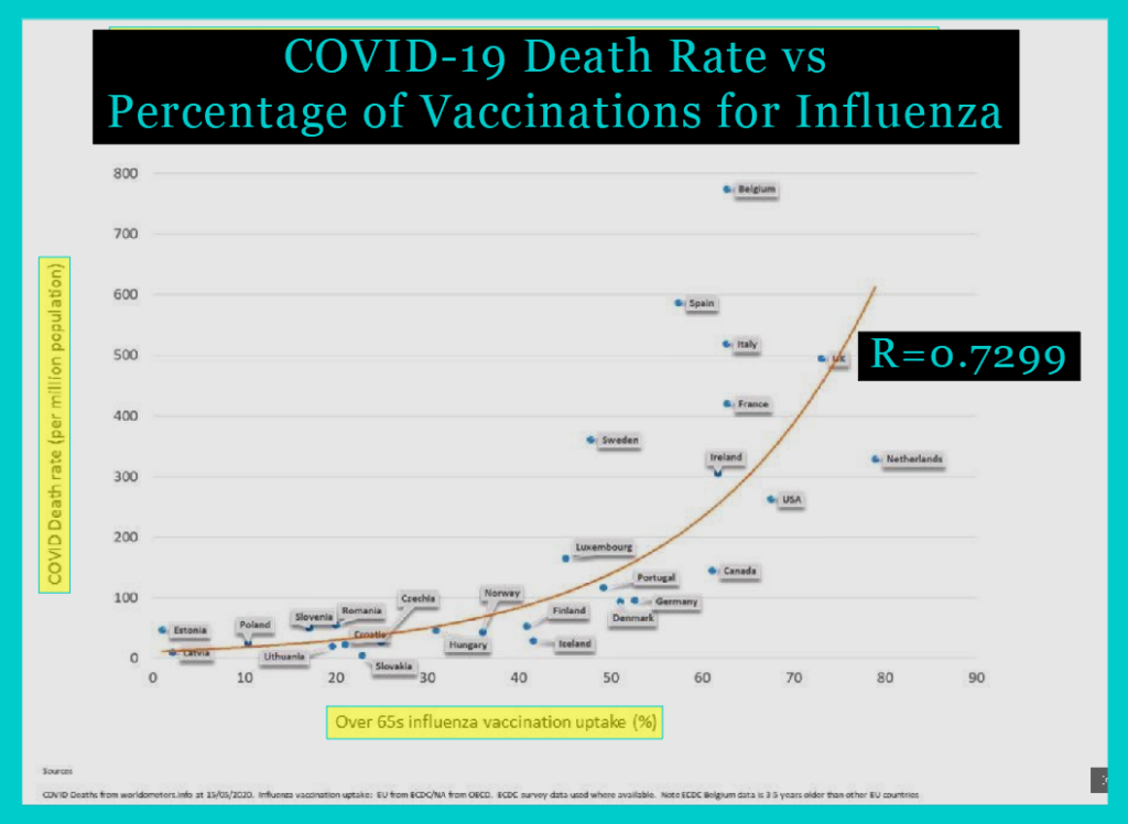
It comes from this blog, authored by “Paul”, who created it in response to a “whimsical suggestion” in the BMJ (here) by Dr Allan Cunningham: to correlate influenza vaccine uptake with Covid-19 death rates. My post above was inspired by Dr Cunningham’s challenge and by seeing the flaws in Paul’s chart and wanting to dig into the data myself.

In his note, Dr Cunningham provided data on influenza vaccine coverage rates in the elderly and covid-19 death rates per million for 20 selected European countries. His source for covid deaths was Worldometers, accessed 21st May 2020. His source for flu shot rates was the OECD. There are 26 European members of the OECD… Dr Cunningham did not include Belgium, Greece or Iceland in his list of 20 countries despite the data being available at the same source he used – with no explanation given. As we have seen, data from Austria, Poland, and Switzerland are not available from the OECD.

Here is a plot of the 20-countries data provided by Dr Cunningham:

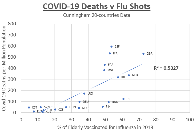
A coefficient of determination, or R-squared, is the proportion of the variance in the dependent variable (covid deaths) that is predictable from the independent variable (flu shot rate). Using just Dr Cunningham’s 20 countries, we find an R-squared of 0.5327 under the assumption of a linear relationship, which corresponds to a correlation coefficient of 0.7299.

On Paul’s chart, this correlation coefficient is displayed prominently… but as we have seen, this value comes from Cunningham’s data as shown on the chart above. Paul’s chart is completely different, so the value of R he shows has no relation to his chart! Paul’s chart displays 27 data points (seven extra), the values plotted are different from Cunningham’s (due to a change to the data source), and the line drawn on the chart is exponential rather than linear (so it has nothing to do with the correlation coefficient of 0.7299, which assumes a linear relationship).

The extra seven countries that Paul added are curious. From among the three countries mysteriously omitted by Dr Cunningham, Paul rightly added back Belgium and Iceland, but not Greece, which would be a significant outlier, weaking the association. Paul adds Poland, which isn’t in the OECD data, and Romania and Croatia, which aren’t even in the OECD. Paul refers to the ECDC as a data source for these three and all other European countries. He may be referring to this publication, but I could not find the exact numbers he used. Adding Poland, Romania and Croatia strengthens the association because apparently they all have low vaccination rates and few Covid-19 deaths.

Strangest of all, Paul has added Canada and USA, being the only two countries on the chart outside of Europe. He uses OECD data for these countries, which makes it strange why he would omit other non-European OECD countries like Korea, New Zealand and Japan. These countries would all weaken the association, and their omission seems somewhat convenient for someone wishing to make the case that there is a strong correlation.

It is misleading to display on the chart an R value that has nothing to do with the data in the chart. It is misleading to cherry-pick countries and omit significant outliers without explanation. I think my charts give a more complete and honest picture than this chart by Paul.

Mitkus Model wrong due to typo

The argument that the amount of aluminum in vaccines is safe relies on a 2011 paper by Mitkus, which presents an aluminum pharmacokinetic model. The paper is flawed. The model is flawed. Here is an example of an error in the Mitkus 2011 paper.

Priest 2004 provided the equation for aluminum retention used in Mitkus’s model. The equation and the half-lives stated in this paper are inconsistent.

1.4 days half-life => exponent of 0.495
40 days half-life => exponent of 0.0172
1727 days half life => exponent of 0.000401

0.595 as 0.495 and 0.172 as 0.0172 look like typos.

Mitkus took the equation and half-lives from Priest’s paper, and apparently did not notice the inconsistency. He not only failed to correct the typos in the equation, he added one of his own, mis-stating 11.4 as 11.

Newton, the original source of the equation and co-author of the 2004 paper by Priest, later authored a paper with the same equation… but with the none of the typos.

Mitkus used the wrong equation

How could Mitkus have made such a basic error?

How did none of the co-authors or peer reviewers spot it?

Why has the paper not been retracted in light of this error?

These typos mean the Mitkus model under-predicts retention of aluminum, particularly in the soft tissues compartment. In the chart below, we can see just how wrong the equation used in the Mitkus model is.

Mitkus used the wrong retention equation

This error alone invalidates the results of the Mitkus model.

Sources:

Priest 2004: The biological behaviour and bioavailability of aluminium in man, with special reference to studies employing aluminium-26 as a tracer: review and study update  https://www.ncbi.nlm.nih.gov/pubmed/15152306

Mitkus 2011: Updated aluminum pharmacokinetics following infant exposures through diet and vaccination https://www.ncbi.nlm.nih.gov/pubmed/22001122

Newton 2012: Long-term retention of injected aluminium-26  https://www.ncbi.nlm.nih.gov/pubmed/22549096

MMR-Autism Association in DeStefano 2004 Study

William Thompson is the CDC whistleblower who revealed that he had been involved in a cover-up of a key result in the vaccine-autism debate.

He was referring to the DeStefano 2004 study of MMR and autism, on which Thompson was a co-author, conducting the statistical analysis. Thompson claimed that an association between MMR and autism in African American boys was identified in the data, but that the finding was omitted from the final paper. He cited the pressure to show no association between MMR and autism, and explained how they tried various statistical techniques to try to hide the association.

The infographic above presents the data behind the debate. Brian Hooker’s 2014 re-analysis of the data shows there is indeed an association between MMR and autism in African American boys in the data.

Forget the politics; the science here is telling us there is an association between a vaccine and autism.

Sources:

Vaccine Autism Studies are Inadequate

In 2012, the Institute of Medicine (IOM) released a comprehensive evidence review entitled “Adverse Effects of Vaccines: Evidence and Causality”.

They looked at 8 different vaccines and 76 different adverse events. One of these adverse events was autism.

  • For 1 vaccine (MMR), the IOM favored rejection of a causal relationship.
  • For 1 vaccine (DTaP), the IOM declared the evidence inadequate to accept or reject a causal relationship.
  • For the other 6 vaccines in the review, the IOM did not look for any evidence regarding a causal relationship.

Clearly then, the correct conclusion of this evidence is NOT that “vaccines do not cause autism”. There is not enough evidence to make that conclusion.

Even if a causal relationship between MMR and autism is rejected, it does not follow that “vaccine do not cause autism” because MMR is only one of 8 or more vaccines, and the evidence is inadequate to accept or reject a causal relationship for them. There have also been no studies looking for associations between cumulative vaccinations, or different timings, or different combinations of vaccines, and autism.

The CDC cites this IOM report for its claim that “vaccines do not cause autism” and yet this report does not support this claim.

Maternal Immune Activation causes Autism

The diagram in the infographic above comes from:

The CDC Vaccine-Autism Studies

The studies cited by the CDC on their “Vaccine Do Not Cause Autism” page cannot possibly support that claim. The CDC’s conclusion is invalid.

See the infographic above for details about why that is.

Autism Defined

Our understanding and conception of autism has changed considerably over the years, as shown in the infographic above.  

Autism Before 1980

The first recognition of autism only occurred in 1943, and for decades it was believed to be very rare, affecting only 1-in-10,000 children.  The first time the American Psychiatric Association (APA) published their list of all known mental disorders, the prestigious Diagnostic and Statistical Manual of Mental Disorders or DSM-1 (1952), it did not include autism.  It used the word autistic only in reference to one of the behaviours associated with childhood-onset schizophrenia.  Autism was also not listed in the second edition, DSM-2 (1968).

Autism in DSM-3

Autism was first listed as a known mental disorder in DSM-3 in 1980.  A category of neurodevelopmental (early onset) disorders was created called the Pervasive Development Disorders (PDDs), which contained infantile autism for when autistic behaviours appeared before 30 months of age and childhood onset PDD for when they appear after 30 months of age. 

These autistic behaviors include lack of responsiveness to other people, deficits in language development and social relationships, resistance to change, attachment to inanimate objects, anxiety and panic attacks, inappropriate fear or rage reactions, oddities of motor movement, and speech and hyper-sensitivity to sensory stimulation. 

A third PDD was atypical autism, a catch-all for when there were impairments in social skills and language but the criteria for a specific PDD cannot be met.

Autism in DSM-4

The DSM-4 in 1994 introduced three areas of diagnosis for the PDDs: impairments in social interaction, impairments in communication, and restricted, repetitive and stereotyped patterns of behavior, interests and activities.  It also renamed and reformulated the PDDs.

Autistic Disorder required onset before 36 months of age and at least 6 of the 12 impairments listed across the three areas of diagnosis.  Those previously diagnosed with infantile autism would in the new system likely be diagnosed with autistic disorder.  Those previously diagnosed with childhood onset PDD or atypical autism would likely be diagnosed with PDD-NOS (for Not Otherwise Specified), the new catch-all for where there are severe deficits in one of the three areas of diagnosis but the criteria are not met for any of the specific PDDs. 

Three new PDDs were added: Asperger’s Disorder was created for those with impairments in social interaction and restricted behaviours, but no impairments in communication, cognition or language skills, and it was considered “mild autism” or “high-functioning autism”.  The other two new additions were Childhood Disintegrative Disorder (CDD), a sudden and severe regressive disorder in multiple areas of functioning with subsequent onset of autistic behaviors, and Rett’s Disorder, a regressive disorder affecting head growth, motor skills, gait and trunk movements, as well as autistic behaviours.  These are both very rare disorders, and Rett’s Disorder is now considered a genetic brain disorder rather than an autism spectrum disorder or PDD.

Asperger’s makes up 17% of cases of PDD, autistic disorder is 31%, but the largest group is PDD-NOS at 53% (Hviid, 2019).  The addition of Asperger’s Disorder (and to a much lesser extent, CDD and Rett’s) would thus have caused only a small step change – ceteris paribus – in the number of people diagnosed with a PDD, as DSM-4 replaced DSM-3.

Autism in DSM-5

The DSM-5 in 2013 replaced the PDD category entirely and replaced it with Autism Spectrum Disorder (ASD).  The PDDs were already considered a spectrum widely known as the autism spectrum, ranging from the most severe (Autistic Disorder) to the less severe (PDD-NOS and Asperger’s).  Autism was no longer the name of one type of PDD, but the whole category, and it was defined as a single spectrum disorder rather than a category of related disorders with distinct names, as PDD had been.

Within ASD, there is a classification by severity in two dimensions: 1) deficits in social interaction and communication, and 2) restricted, repetitive behavior, interests, or activities.  Three severity levels (mild, moderate and severe) are defined by how much support the individual requires.  Most of those previously diagnosed with autistic disorder would now be diagnosed with moderate or severe ASD (aka autism), while most of those previously diagnosed with Asperger’s disorder would now be diagnosed with mild or moderate autism.  It is possible to be diagnosed as having one severity level for social deficits and a different severity level for restricted behaviors, giving nine possible severity level combinations within the spectrum.

The DSM-5 also created a new neurodevelopmental disorder called Social (Pragmatic) Communication Disorder (SCD) for cases that meet the social deficits criteria for ASD but not the restricted behaviors criteria.   According to one study (Kim, 2014), only 63% of those with a previous diagnosis of PDD-NOS meet the DSM-5 criteria for ASD, with 32% lacking the restrictive behaviours criteria and so would now be diagnosed with SCD, not ASD.  Those previously diagnosed with PDD-NOS who do meet the ASD criteria are likely to have either a mild or moderate DSM-5 severity level (Walker, 2004). 

The impact of a third of those with PDD-NOS (the largest PDD disorder) being taken out of the umbrella of ASD should have a noticeable decrease – ceteris paribus – in autism diagnoses as DSM-5 replaces DSM-4.  The definition of ASD in DSM-5 is tighter than the definition of PDD in DSM-4 and may be tighter than the definition of PDD in DSM-3 as well.

Autism in ICD-10 Codes

The World Health Organisation (WHO) maintains a comprehensive medical coding system known as the International Classification of Diseases (ICD).  The current iteration of this system is ICD-10, which has been used since 1994.  Chapter 5 contains the codes for mental and behavioural disorders (F00-F99) and it has codes for “childhood autism” (F84.0), “atypical autism” (F84.1) and Asperger’s disorder (F84.5), “Other PDD” (F84.8) and “Unspecified PDD” (F84.9) all within the category of pervasive development disorders (F84). 

These five ICD-10 codes are considered to cover the whole autism spectrum and epidemiological studies of autism generally define an outcome of autism as a diagnosis with one of these five ICD-10 codes (for example, Hviid 2019). 

These codes map easily to the disorders in DSM-4 and DSM-3: childhood autism is the same as infantile autism (DSM-3) and autistic disorder (DSM-4); Asperger’s Disorder is defined the same way as in DSM-4; PDD-NOS (DSM-4) is split between ICD codes for atypical autism, other PDD and unspecified PDD, with atypical autism being defined in a way similar to the DSM-3 definition.

Autism Diagnostic Criteria

Despite the many taxonomical changes within the PDD / ASD category of disorders over the years, the diagnostic criteria have been refined and elaborated with each iteration of the DSM, but the basic idea has always been the same.  Autism has always been defined as a disorder with two fundamental defining elements: deficits in social communication and social interaction, and restricted, repetitive patterns of behavior, interests and activities. 

DSM-5 gives the clearest diagnostic criteria for each of these two elements.  It provides three illustrative examples of social deficits, all of which must be met for a diagnosis, and four illustrative examples of restricted behaviors, two of which must be met for a diagnosis.  The examples are:

Persistent deficits in social communication and social interaction across multiple contexts, as manifested by ALL OF the following, currently or by history:

  • Deficits in social-emotional reciprocity, ranging, for example, from abnormal social approach and failure of normal back-and-forth conversation; to reduced sharing of interests, emotions, or affect; to failure to initiate or respond to social interactions.
  • Deficits in nonverbal communicative behaviors used for social interaction, ranging, for example, from poorly integrated verbal and nonverbal communication; to abnormalities in eye contact and body language or deficits in understanding and use of gestures: to a total lack of facial expressions and nonverbal communication.
  • Deficits in developing, maintaining, and understanding relationships, ranging, for example, from difficulties adjusting behavior to suit various social contexts; to difficulties in sharing imaginative play or in making friends; to absence of interest in peers.

Restricted, repetitive patterns of behavior, interests, or activities as manifested by AT LEAST TWO of the following, currently or by history:

  • Stereotyped or repetitive motor movements, use of objects, or speech (e.g., simple motor stereotypies, lining up toys or flipping objects, echolalia, idiosyncratic phrases).
  • Insistence on sameness, inflexible adherence to routines, or ritualized patterns of verbal or nonverbal behavior (e.g., extreme distress at small changes, difficulties with transitions, rigid thinking patterns, greeting rituals, need to take same route or eat same food every day).
  • Highly restricted, fixated interests that are abnormal in intensity or focus (e.g., strong attachment to or preoccupation with unusual objects, excessively circumscribed or perseverative interests).
  • Hyper- or hyporeactivity to sensory input or unusual interest in sensory aspects of the environment (e.g., apparent indifference to pain/temperature, adverse response to specific sounds or textures, excessive smelling or touching of objects, visual fascination with lights or movement).

For a diagnosis of ASD, symptoms must also be present in the early developmental period (but may not become fully manifest until social demands exceed limited capacities, or may be masked by learned strategies in later life), they must cause clinically significant impairment in social, occupational, or other important areas of current functioning, and these disturbances are not better explained by intellectual disability or global developmental delay. 

Clinical Significance

The requirement for onset during the “early developmental period,” meaning early childhood, obviously means that adults cannot develop autism.  However, adults can be and are diagnosed with autism if they are impaired significantly enough by their social deficits and repetitive behaviors today to warrant a diagnosis, without any evidence that their autistic behavior started in the early developmental period.  The age of onset diagnosis criteria is essentially ignored as it is assumed that any adult that meets the criteria for autism today must have been autistic their whole life.

The requirement for “clinically significant impairment” is standard wording throughout the DSM-5 for all mental disorders.  It means that it is left entirely at the discretion of clinicians to judge whether a child (or adult) is impaired *significantly enough* by his social deficits and repetitive behaviors to get a diagnosis of ASD.  Clinicians get to draw the line between marginal cases of mild ASD and no ASD, and where they draw that line is flexible and may have changed over time to include more people: an adult previously considered merely as having autistic-like traits (perhaps an introvert with restricted interests, a geek or an eccentric) may now get a diagnosis of ASD, if he seeks one.  There are incentives for adults to get a diagnosis, for parents and schools to have their children diagnosed, and for clinicians to give diagnoses in marginal cases.  There is a clear danger of over-diagnosis of autism due to the flexibility of the clinical significance requirement, and this must be borne in mind when looking at historical statistics of autism prevalence and incidence.

Conclusion

Clear and well-understood definitions are essential for productive discussion and good science.  When discussing autism, it is important that all the participants understand whether the term is being used:

  • in the wider sense of anyone on the autism spectrum in the DSM-5 conception, roughly equivalent to what DSM-4 called PDDs
  • in the narrower sense of autistic disorder (only 31% of PDDs) in the DSM-4 conception, roughly equivalent to severe autism in the DSM-5 conception. 

The wider sense includes those with Asperger’s (17%) and PDD-NOS (53%), which are likely mild or moderate autism in the DSM-5 conception. 

When discussing autism, when reviewing data from epidemiological studies, comorbidity studies, historical trends, independence surveys, and so on, it is crucial to understand if the data refers to the whole autism spectrum or just those with severe autism, or those with autism and some other condition comorbid with autism, such as a language disorder or intellectual disability.

Release the VSD Data!

The Institute of Medicine (IOM) systematic review entitled “The Childhood Immunization Schedule and Safety: Stakeholder Concerns, Scientific Evidence, and Future Studies (2013)” confirmed there had been no studies of the vaccine schedule, and it called for such studies to be done.

It then tells us the most feasible way to carry out these urgently-needed studies:

The most feasible approach to studying the safety of the childhood immunization schedule is through analyses of data obtained by VSD. VSD is a collaborative effort between CDC and 9 managed care organizations that maintain a large database of linked data for monitoring immunization safety and studying potential rare and serious adverse events. VSD member sites include data for more than 9 million children and adults receiving vaccinations on a variety of immunization schedules.

The VSD (Vaccine Safety Datalink) is potentially a goldmine of data that could be decisive in the vaccine science debates, but the CDC keeps it locked up. It makes the data available only to select individuals; it is not publicly available for independent researchers to analyse.

Making anonymised VSD data available to everyone would be an easy and cheap way to enable epidemiological studies of all different vaccine schedules to be carried by anyone who has doubts about vaccine safety or efficacy and wants to verify the raw data.

Why doesn’t the CDC want independent researchers or parents to be able to compare health outcomes between populations vaccinated on different schedules or unvaccinated?

Sources:

The Vaccine Schedule has Not Been Tested

The vaccine schedule has not been tested.

This is according to the Institute of Medicine (IOM) systematic review entitled “The Childhood Immunization Schedule and Safety: Stakeholder Concerns, Scientific Evidence, and Future Studies (2013)”, a report which is cited by the CDC.

Here is the full quote:

In summary, few studies have comprehensively assessed the association between the entire immunization schedule or variations in the overall schedule and categories of health outcomes, and no study has directly examined health outcomes and stakeholder concerns in precisely the way that the committee was charged to address in its statement of task. No studies have compared the differences in health outcomes that some stakeholders questioned between entirely unimmunized populations of children and fully immunized children. Experts who addressed the committee pointed not to a body of evidence that had been overlooked but rather to the fact that existing research has not been designed to test the entire immunization schedule.

Vaccines have been tested, but the vaccine schedule has not been.

A test of the vaccine schedule would entail comparing health outcomes between populations given different combinations of vaccines, including fully unvaccinated, selectively vaccinated, and fully vaccinated according to the recommended schedule (which is different in different countries). As the IOM quote above makes clear, there are no such studies.

Retrospective cohort and case-control studies comparing health outcomes between populations vaccinated using different schedules are urgently needed.

Sources:

How We Conquered Measles

In 1915, in England & Wales, there were 16,455 deaths from the measles; 70% of measles deaths were children aged 1-4. Measles was the biggest killer of toddlers, responsible for 20% of all toddler deaths.  It was also the 2nd biggest killer (behind diphtheria) of children aged 5-9. Although 1915 was a peak year, the average at the time was around 10k total measles deaths per year. 

In 1994, there were no measles deaths at all. From then until now, there have been few years where we have had more than one measles death.

How did we achieve this? How did we conquer measles? 

The answer can be found in this chart that shows the number of measles deaths (black) between 1901 and 2016, and the number of measles notifications (red) between 1940 and 2016.

1915 to 1955: Dramatic Reduction in CFR

From 1915 to 1955, measles deaths reduced by 99%, from over 10,000 deaths per year to below 100 deaths per year.

Most of the decline happened between 1915 and 1935.  In 1935, there were only 1,346 deaths from measles, a reduction of 92% over a 20-year period.  The measles death rate fell even faster than the overall infant mortality rate; it was now responsible for only 7% of deaths of children aged 1-4 (now only the 3rd biggest killer), and only 2% of deaths of children aged 5-9 (now only the 10th biggest killer).  

In 1955, there were only 176 deaths from measles, a reduction of 99% over a 40-year period.  In most years of the 1960s, there were fewer than 100 measles deaths per year, and measles was no longer among the top 10 killers of children of any age group. Measles was now responsible for only 3% of deaths of children aged 1-4 (the 7th biggest killer) and 2% of deaths of children aged 5-9 (the 9th biggest killer). 

Turning now to measles notifications, for which we have data only back to 1940, we can see that the number of notifications of measles was flat from 1940 to 1968 (the pre-vaccine period), at around 400k on average. The driver behind the dramatic decrease in the number of deaths was therefore a dramatic reduction to the Case Fatality Rate (CFR), i.e. the number of deaths per case (or the inverse of the survival rate). Just as many children caught measles, but far fewer died from it.

We can use notifications as a proxy for cases to calculate the CFR for the period after 1940. To estimate the CFR for the period 1901-1940 we need to use birth numbers, as in the following chart:

By assuming a similar proportion of children caught the measles before 1940 as in 1940-68 (i.e. most of them), we can extrapolate the CFR backwards, giving us the following chart:

The CFR prior to 1915 was over 2%, meaning that 1-in-50 children who caught measles died from it. By 1940, it had decreased to 0.2% (1-in-500), and by 1955 it had decreased to just 0.02% (1-in-5000). This is a 99% reduction in the CFR. This reduction in the CFR is why measles was no longer considered a serious, life-threatening illness during the period 1955 to 1968; 99.98% of children survived it. The average number of measles deaths per year was down to below 100 by 1955.

1955 to 1968: CFR Stops Decreasing

In 1955 the incredible reduction in the CFR suddenly stopped. It remains at around 0.02% even today, as can be seen in this chart:

Let us now re-scale the deaths axis of our first chart to see what this meant for the deaths figures after 1955:

As a result of the flat CFR, the number of deaths stayed at just below 100 per year for the period 1955-1968. The record lowest numbers of measles deaths in the pre-vaccine era were in 1956 (30 deaths), 1960 (31 deaths), 1962 (39 deaths). The most deaths in this period were in 1961 (152 deaths), 1963 (127 deaths), and 1965 (115 deaths) and no other years in this period had more than 100 deaths.

1968 to 1997: Vaccines Reduce Measles Cases

From 1968 to 1997 there was a 99% reduction in measles cases. The majority of that reduction followed the introductions of the measles vaccine (1968) and the MMR vaccine (1988). From 1968 to 1971, the annual number of measles notifications fell by over 60%, from 400k to 150k. From 1988 to 1991, notifications fell by 90%, from 100k to 10k. With a flat CFR, the 99% reduction in cases from 1968 to 1997 meant a 99% reduction in deaths, from 100 per year before vaccines down to just 1 per year.

1997 to present: Measles Now Rare

In most years since 1997, there have been under 5k cases and rarely more than 1 death, as we can see by one final re-scaling of the chart:

How then did we conquer measles?

Measles killed over 10,000 per year before 1915 but fewer than 100 per year by 1955.  This 99% reduction in measles deaths was due to a dramatic reduction in the deadliness of the disease between 1915 and 1955.  This could have been due to a healthier environment (higher standards of hygiene, better sanitation systems, more nutritious food, cleaner drinking water and air, less cramped living and working conditions, etc) or to better treatment of measles cases (improved medical knowledge among doctors and the public, better access to healthcare, more effective quarantine procedures, etc), or both. 

The healthier environment and better quality treatments deserve credit for making measles a relatively mild disease; these developments saved thousands of lives each year, just in England & Wales. The measles and MMR vaccines reduced the number of measles cases and measles deaths by another 99%, saving dozens more lives per year. Vaccines deserve credit for making it rare for anyone to suffer from the measles.

Sources: